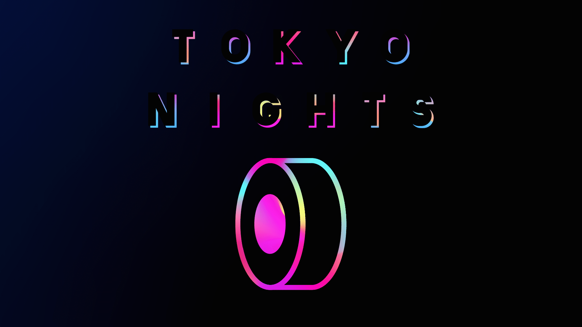
Tokyo Nights is a branding project for a fictional Sushi bar. The project is based on my own Tokyo Nights fluorescent typeface design, drawing inspiration from cyber punk, Japanese minimalism and LoFi music.
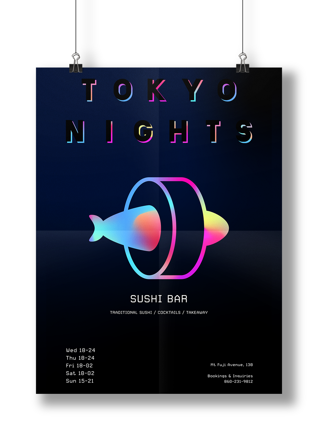
Poster for Tokyo Nights Sushi Bar
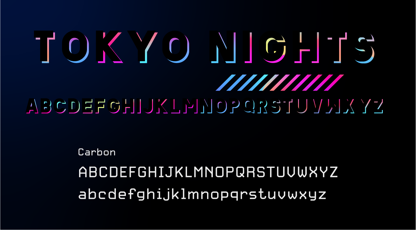
The typeface Tokyo Nights is used for all display text. The Carbon font family is used for body text.
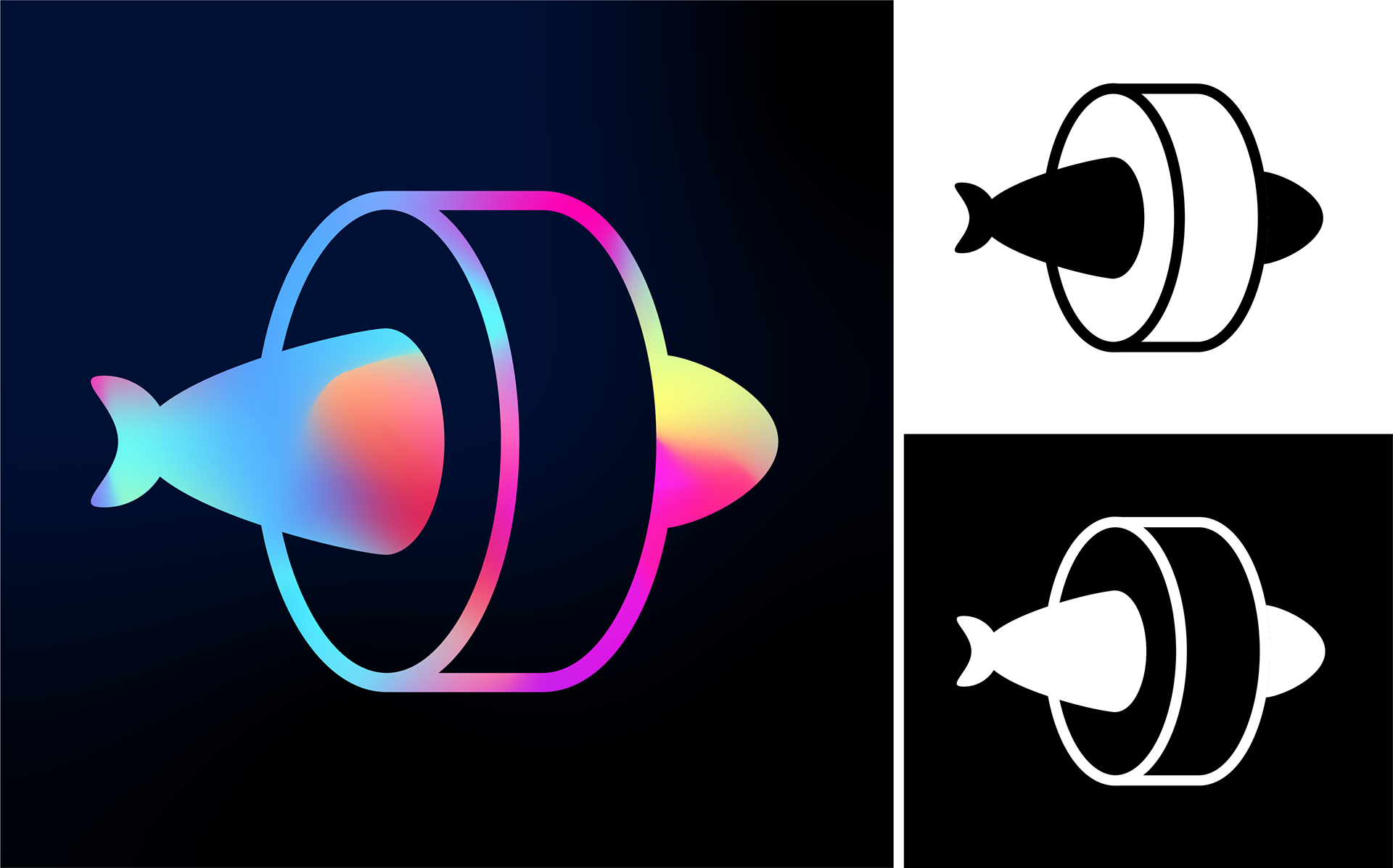
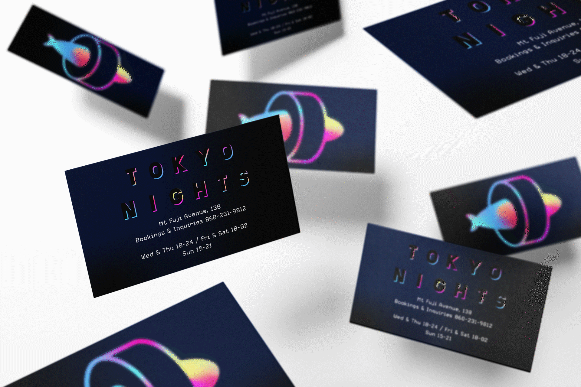
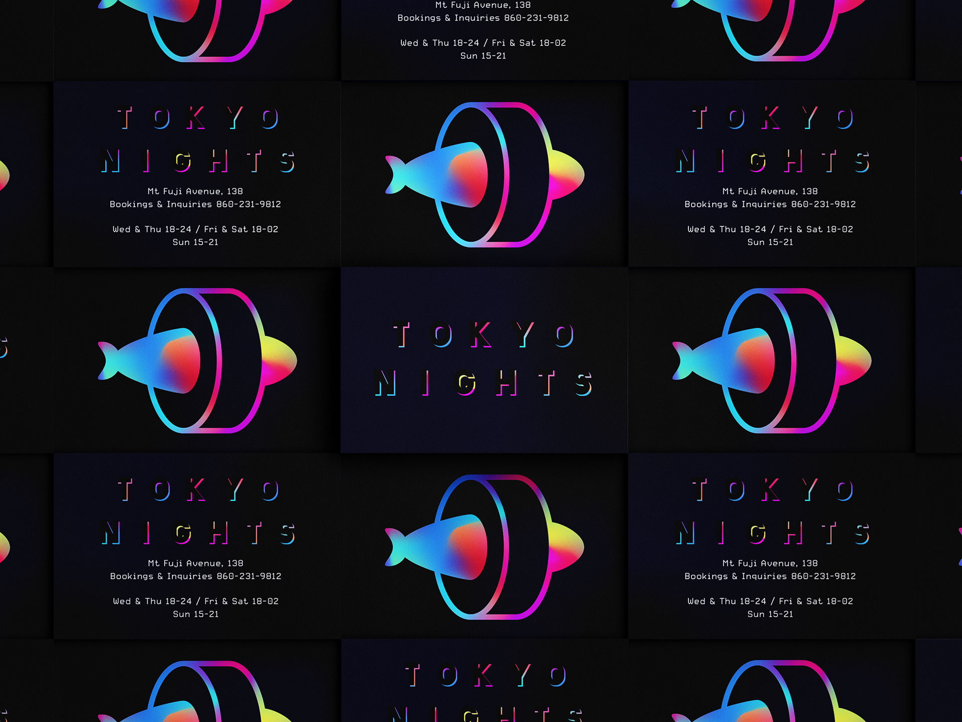
The logo is a simple silhouette of a fish inside a piece of maki, a typical sushi dish.
There are 3 variations of the logo. The main logo in color on a dark background is the preferred design, but where needed the black and white logo designs can be used on a dark or light background.
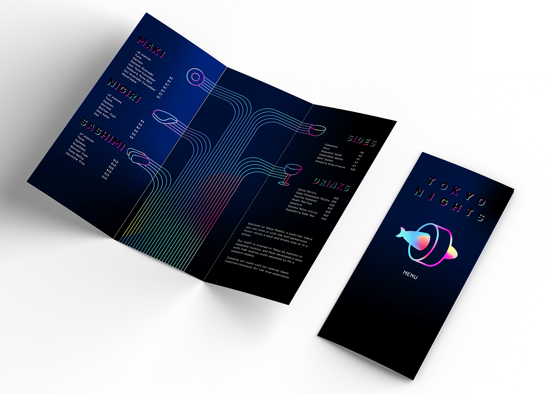
The business card features the eye catching logo on one side, with the restaurant title and contact details on the other.
The menu is a simple trifold page, ideal for handing out to takeaway customers. As printing and folding the menu is an easy job, Tokyo Nights can guarantee a mint condition menu to all customers, at any time of the night.