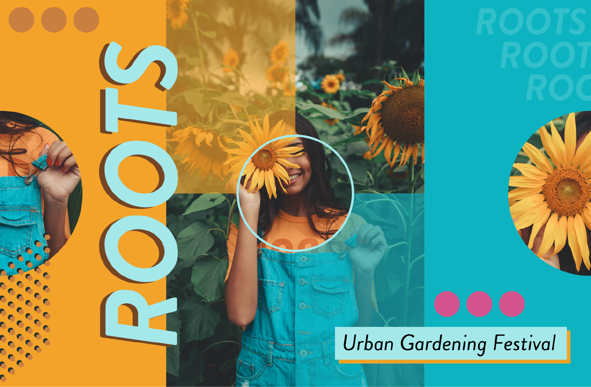
This is a branding project for Roots, a fictional urban gardening festival.
The logotype is simply a double layer of the word "Roots" in the brand typeface. The bottom layer is slightly offset from the top layer to create dimension. The logo can be varied using the different branding colors.

The brand colors range from a light blue to a dark green as the main contrasting colors.
These two colors are then accented with earthy tones combined with a bright blue and pink to communicate the theme of the festival: Gardening in an urban environment.
These two colors are then accented with earthy tones combined with a bright blue and pink to communicate the theme of the festival: Gardening in an urban environment.

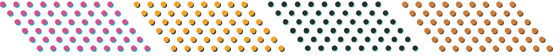
This dotted pattern can be found throughout the branding in several contexts. The pattern resembles seeds being planted in soil, it keeps the same offset style as the logo and can also be used in several different color combinations.
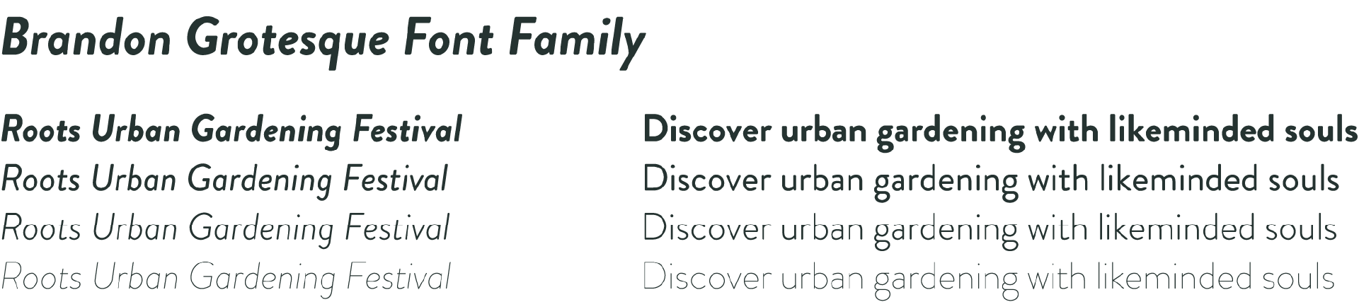
Roots uses Brandon Grotesque throughout its visual identity. The italic style is used for display text, using font weight to determine hierarchy. For body text the regular style is used, again with varying font weights to determine hierarchy and to highlight certain sections.
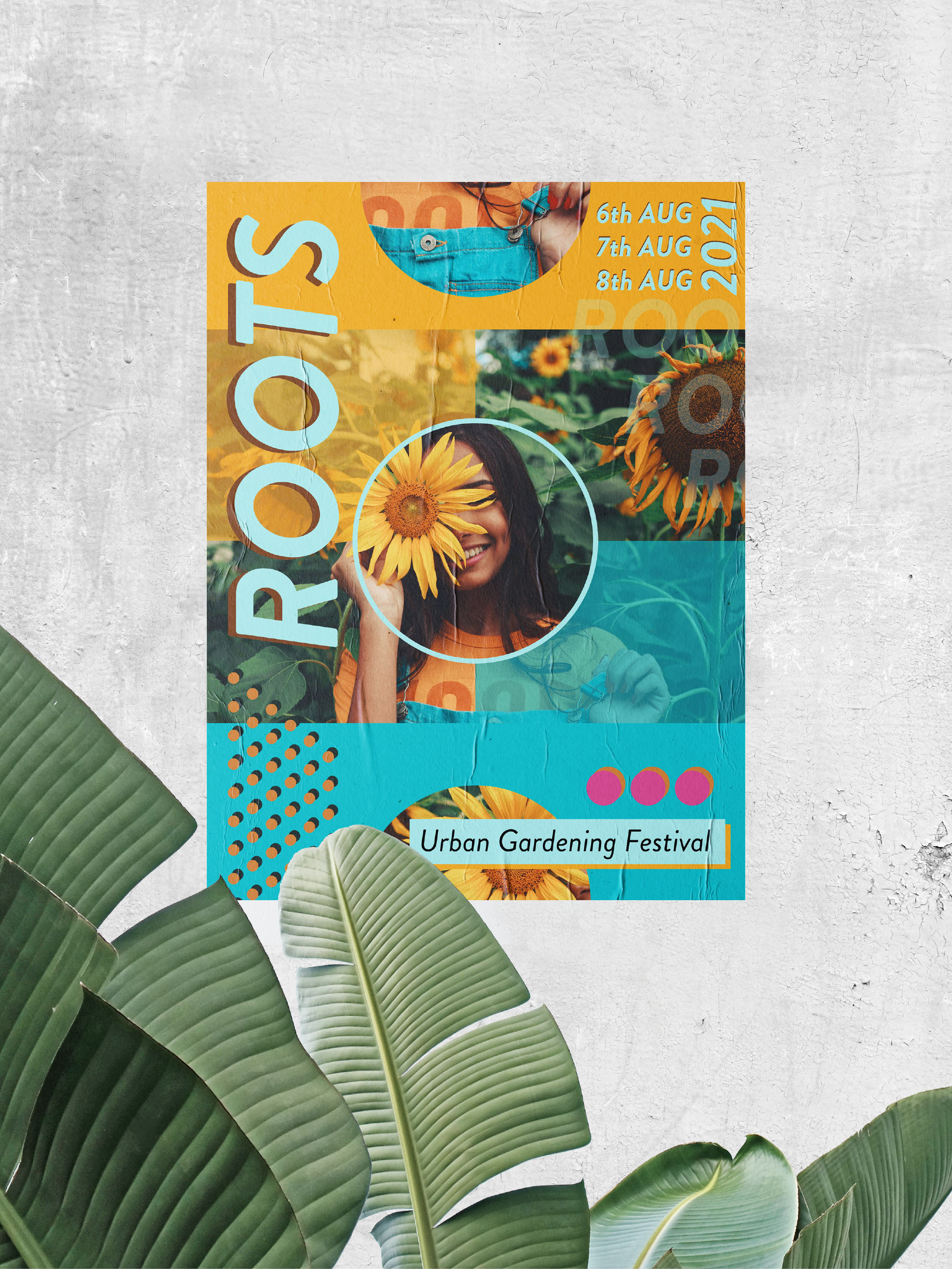
Print ad for the festival that displays the visual guidelines in action.
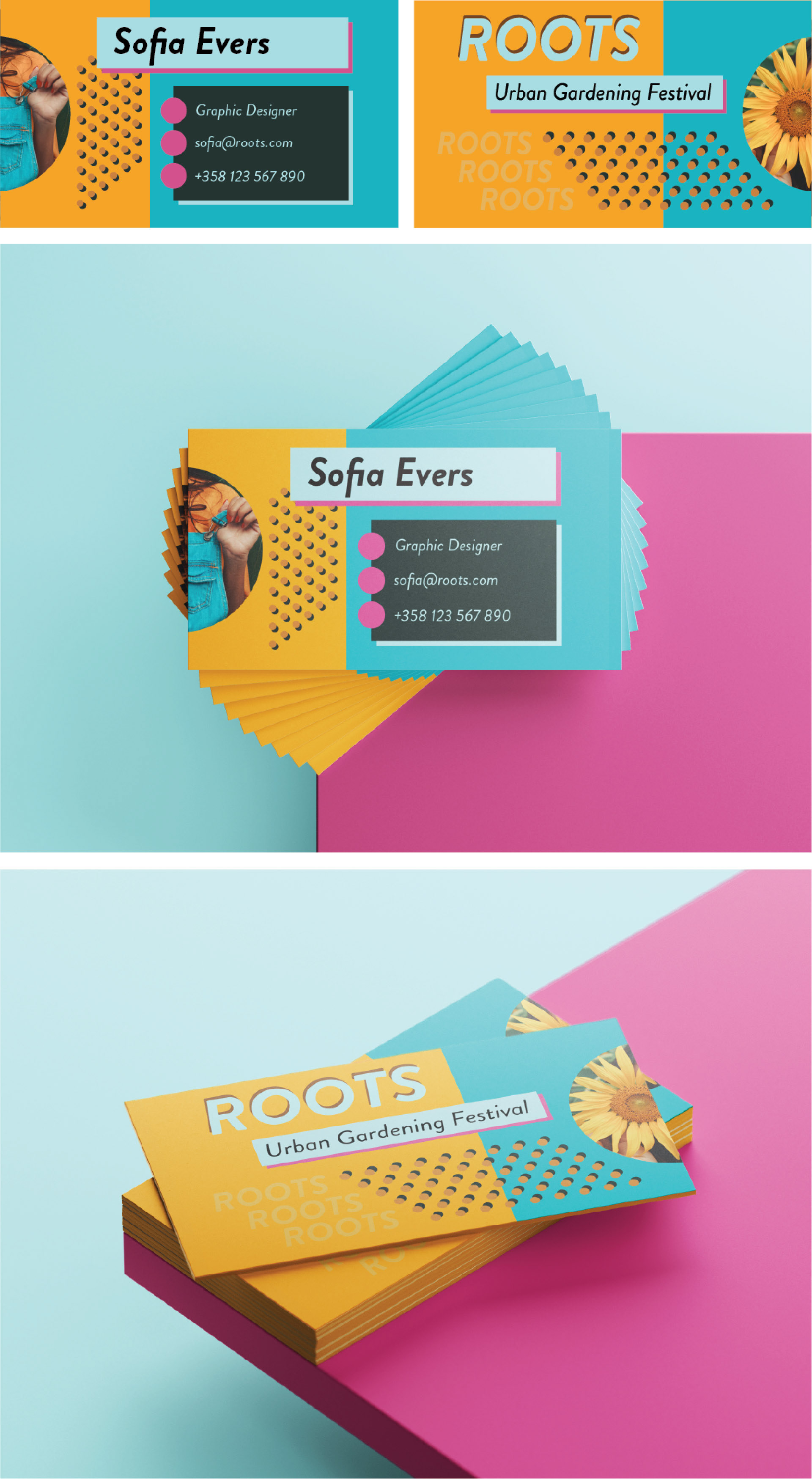
The staff working for the festival are all provided with their personal business card.
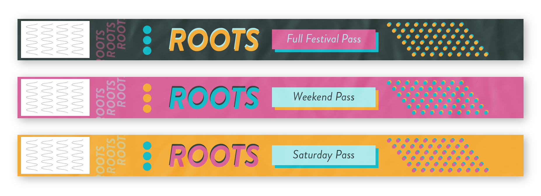
The tickets for the festival are provided as personal wristbands. There are 3 different tickets that are easily distinguished from each other with their base colors.
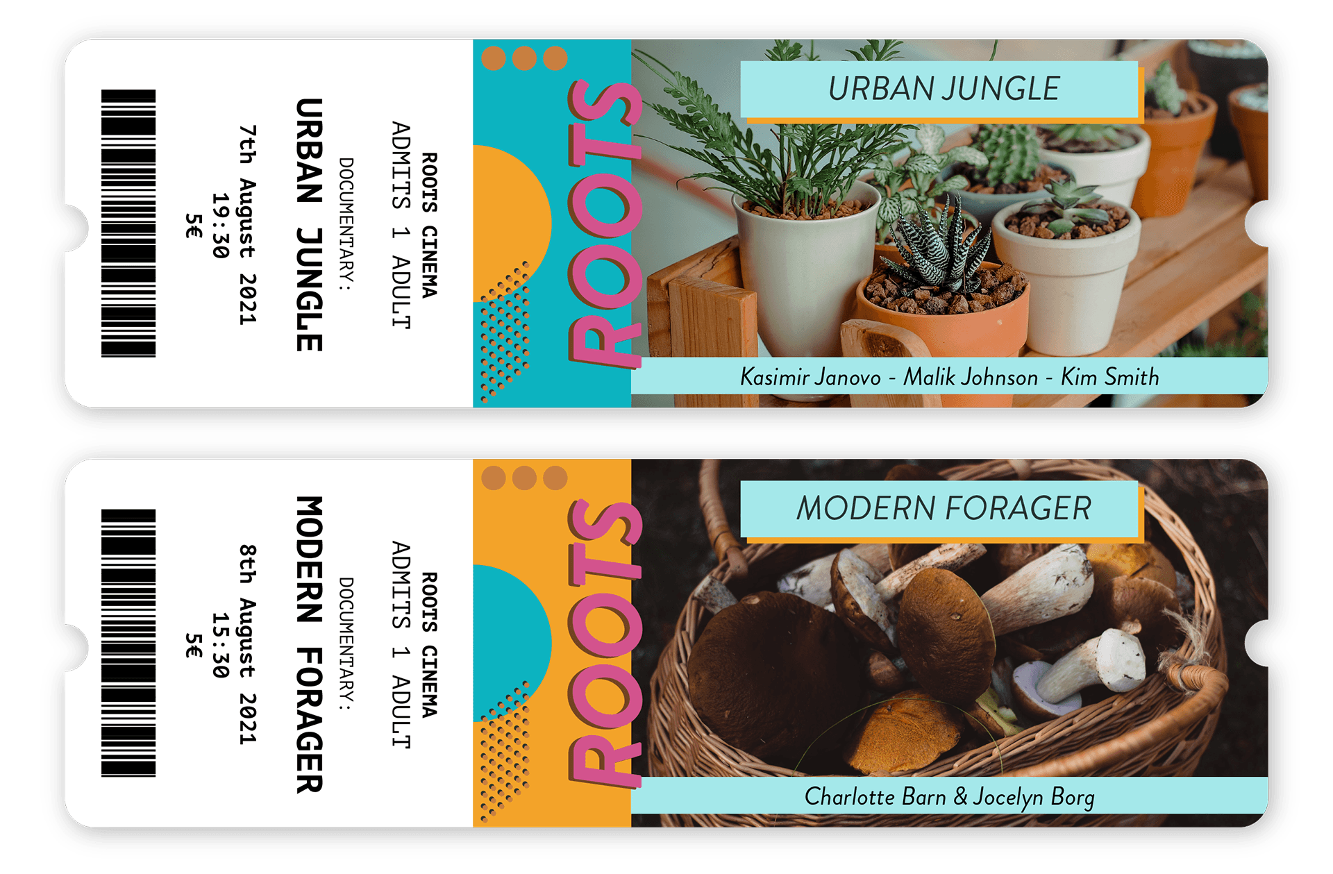
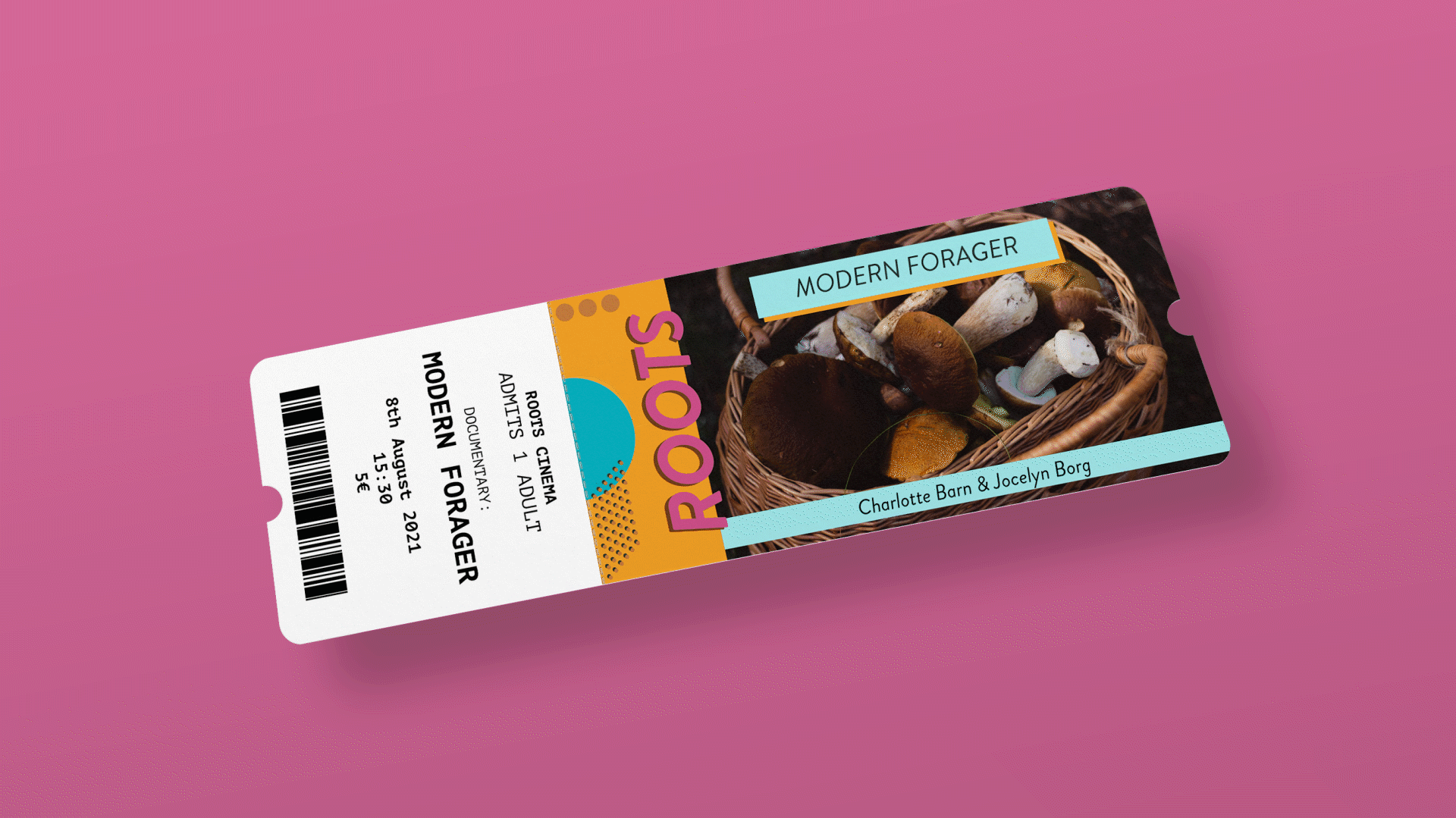
The visitors have the chance to purchase additional movie tickets to get access to the premiere of two documentaries during the festival.
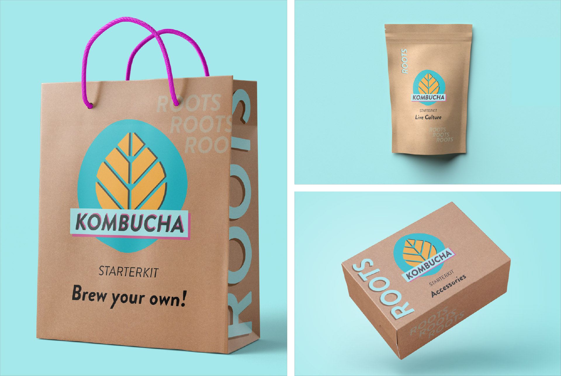
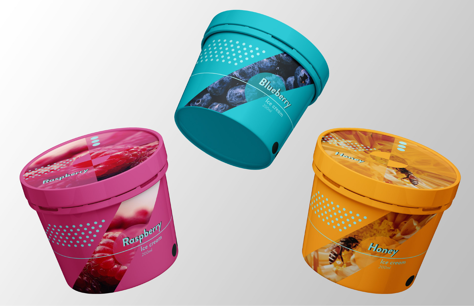
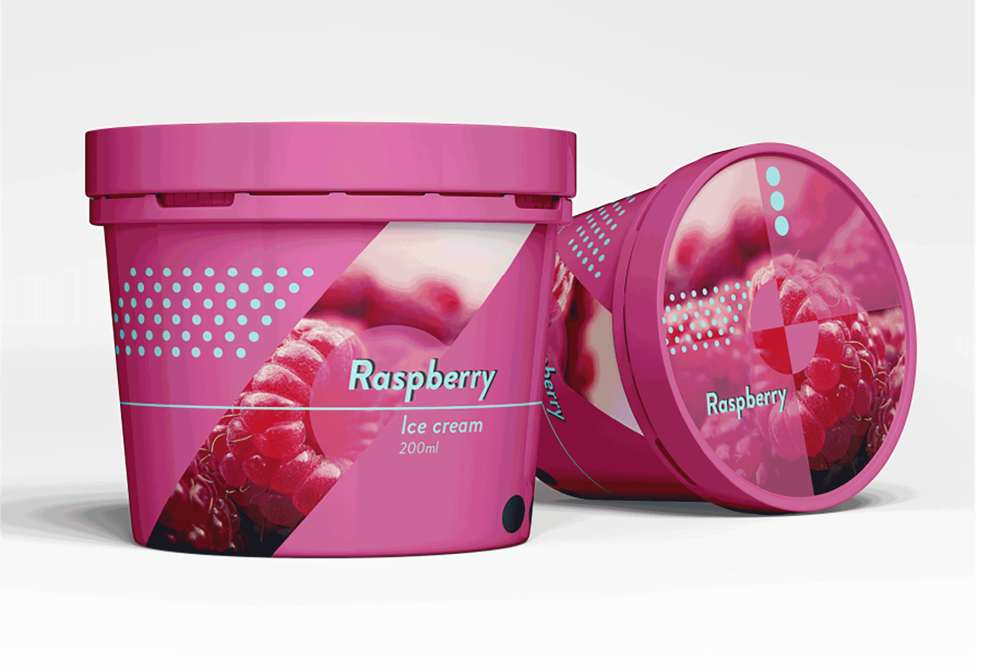
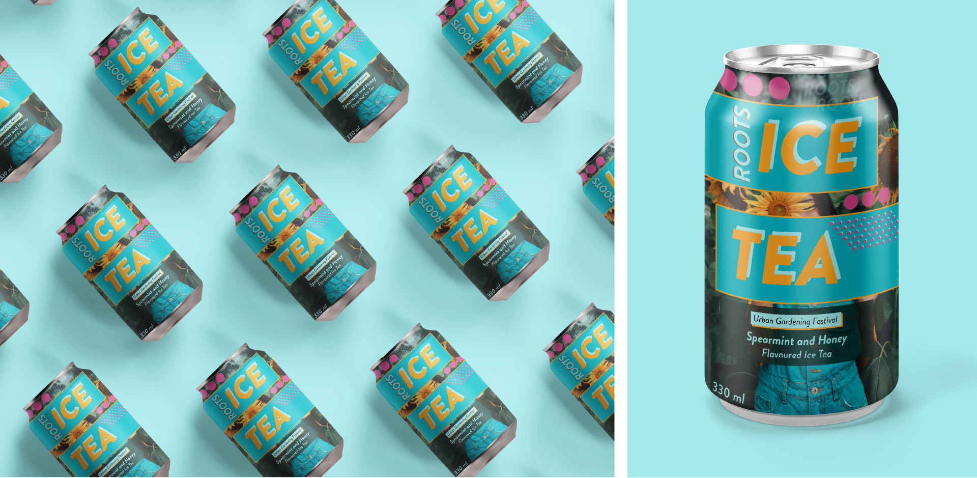
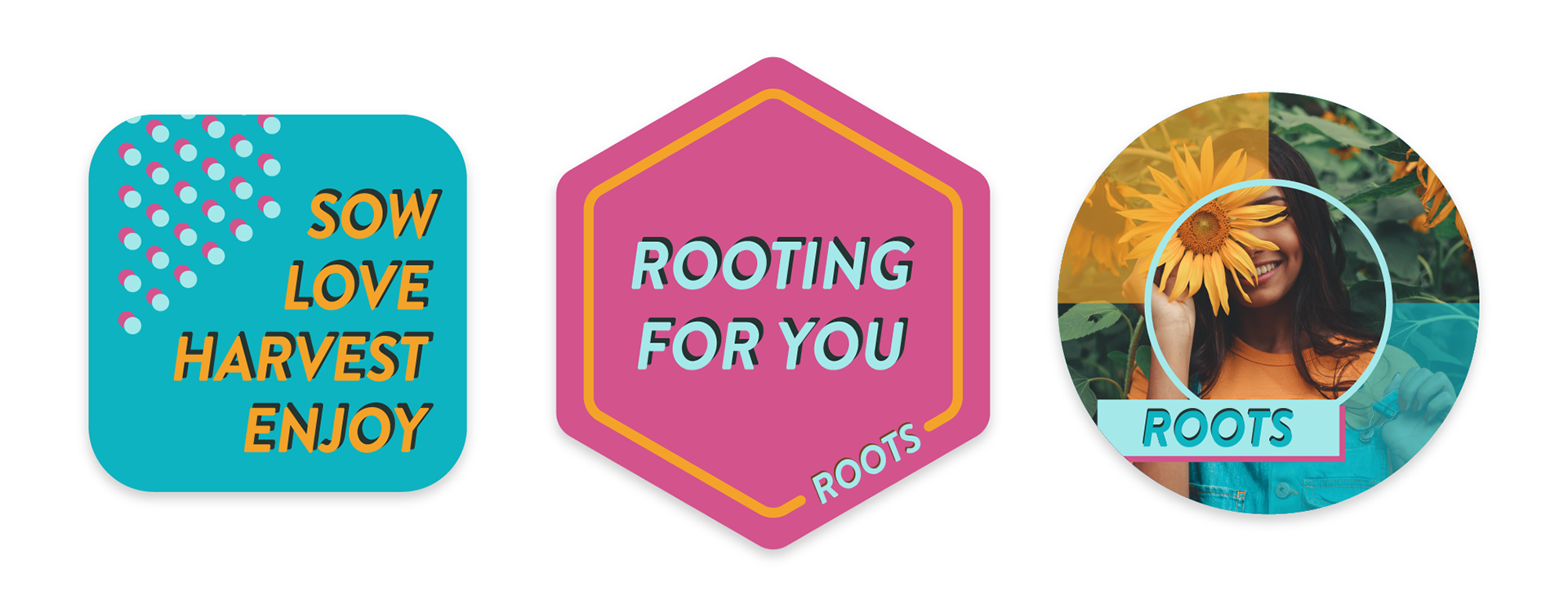
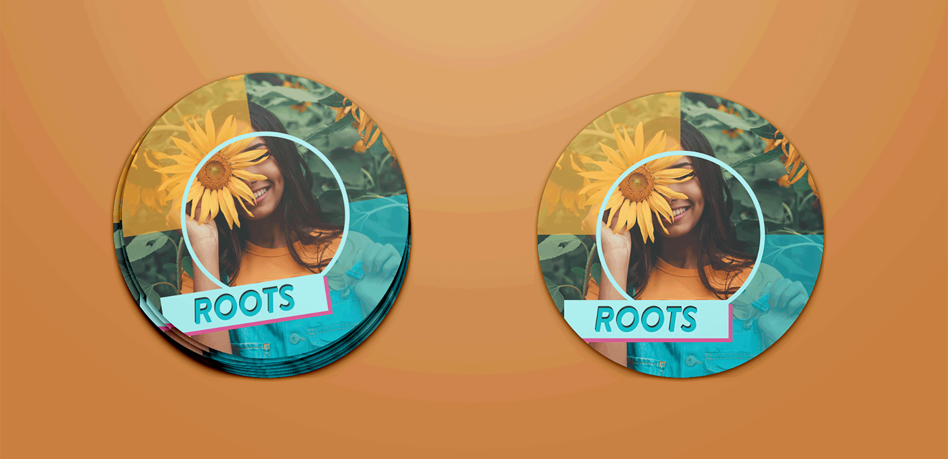
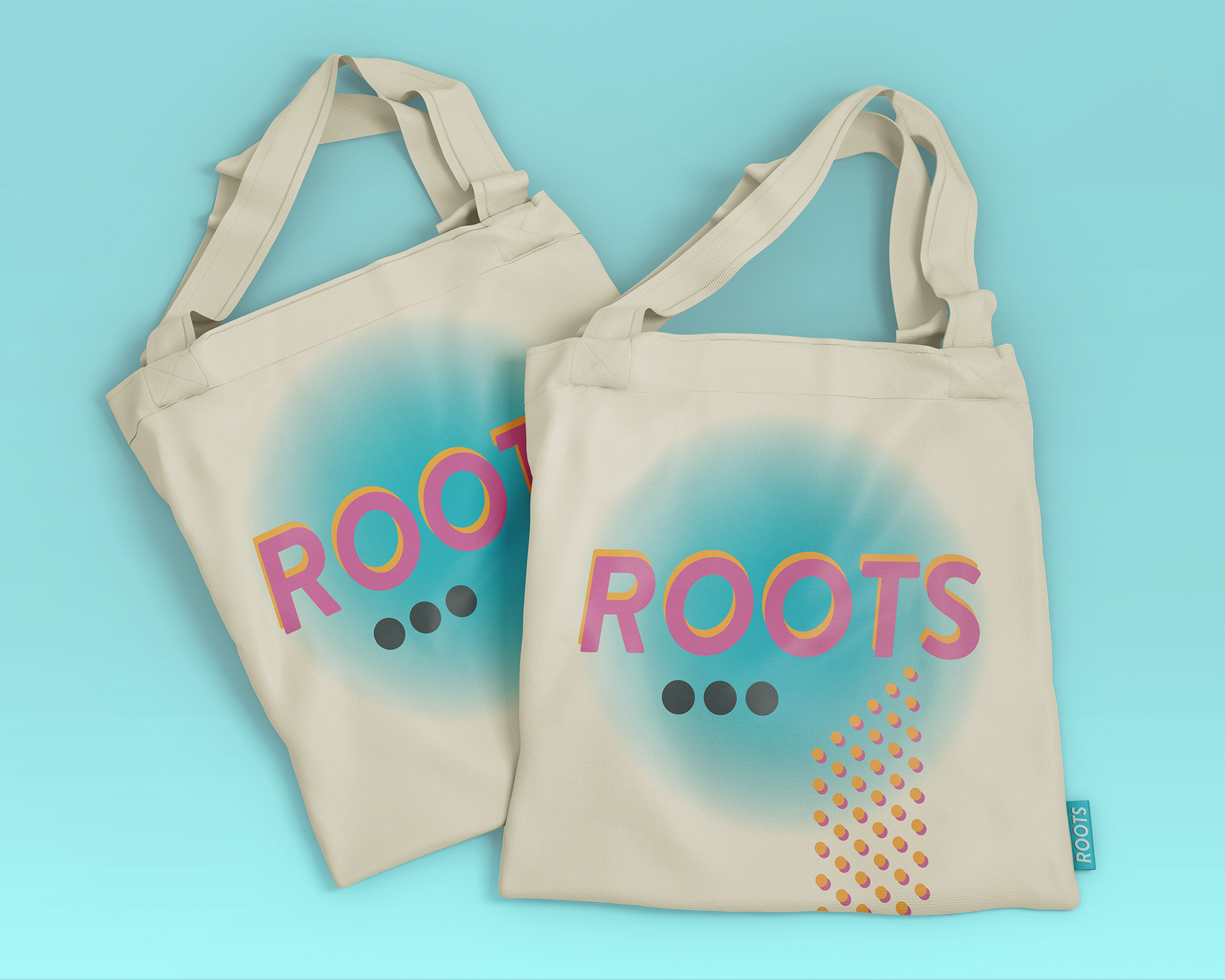
Roots has a series of products that can be used for marketing purposes before the festival or sold as merchandise during the festival. Roots has their own Kombucha kit, ice cream and ice tea, as well as stickers and a tote bag.